
This whole book-writing thing is getting realer every day. I am close to publishing my first book called What Does Your Fortune Cookie Say? with Ripples Media. And I am learning a lot in the process. It turns out that you can’t just throw 200 pieces of paper on a shelf and call it a book. To be ‘official’ you have to put a cover on it and bind the pages together. Rules…
So rather than try to disrupt the entire book publishing industry with an innovative loose-leaf style book, I have decided to cave in and create a cover for my book. Boring, I know. But you have to pick your battles.
Here are 5 book covers I am considering. Now, I’d love to have your help. Take a look and respond in the comments section with the book cover you prefer. You could either describe your favorite option in great detail, or simply use the letter that goes with the cover design. Your choice.
The Options:
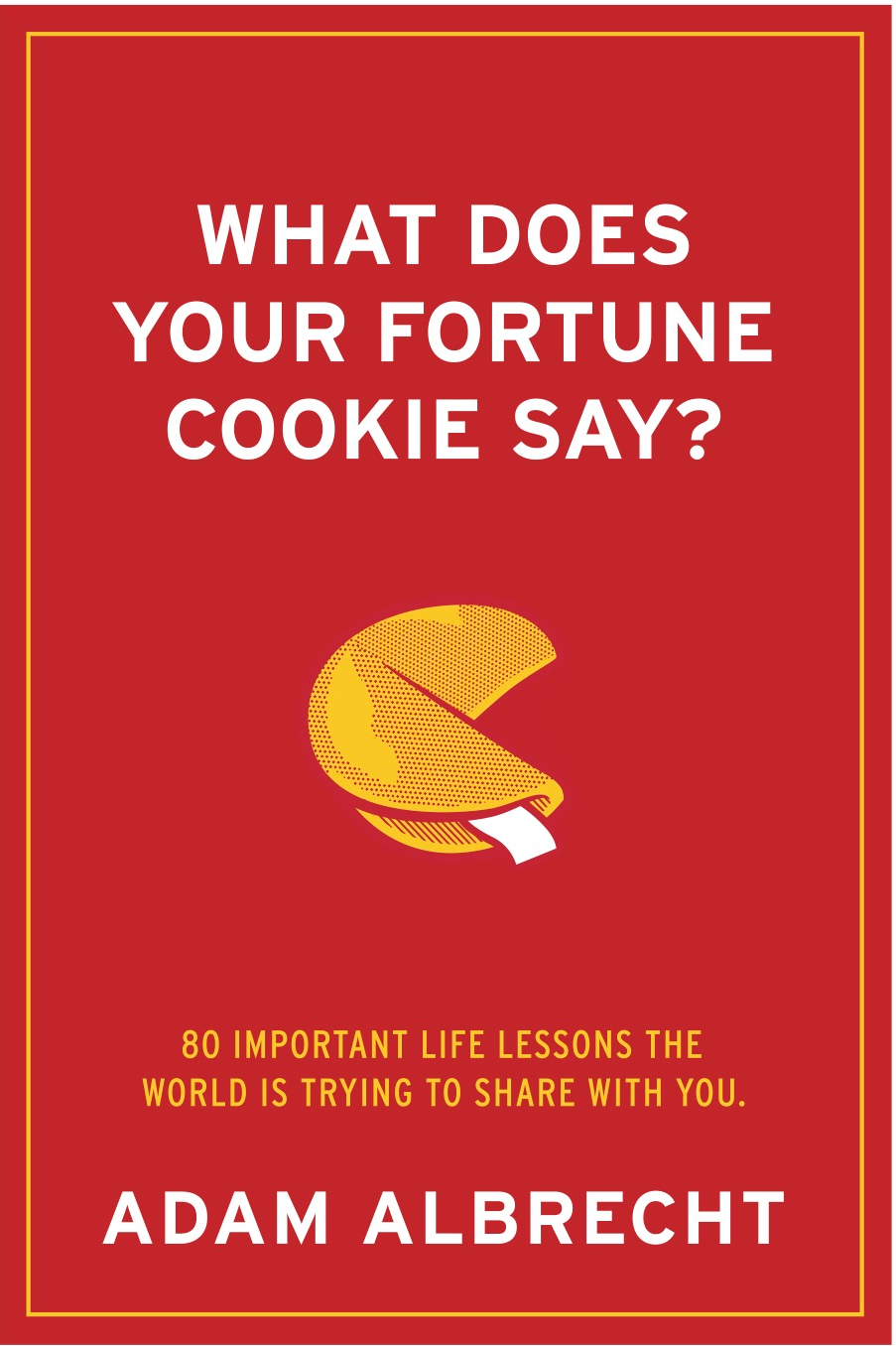
A
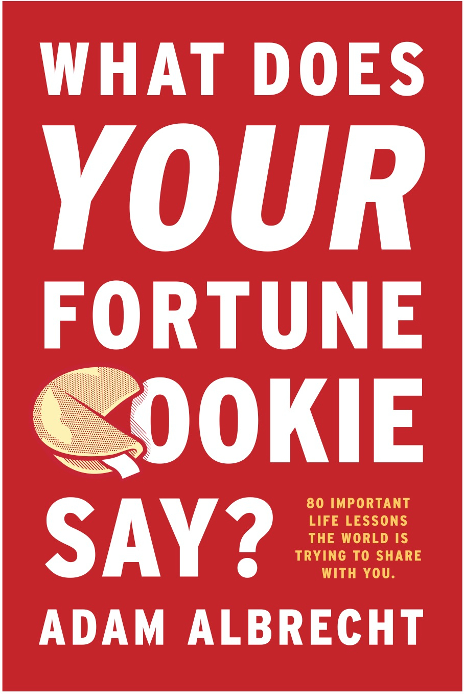
B
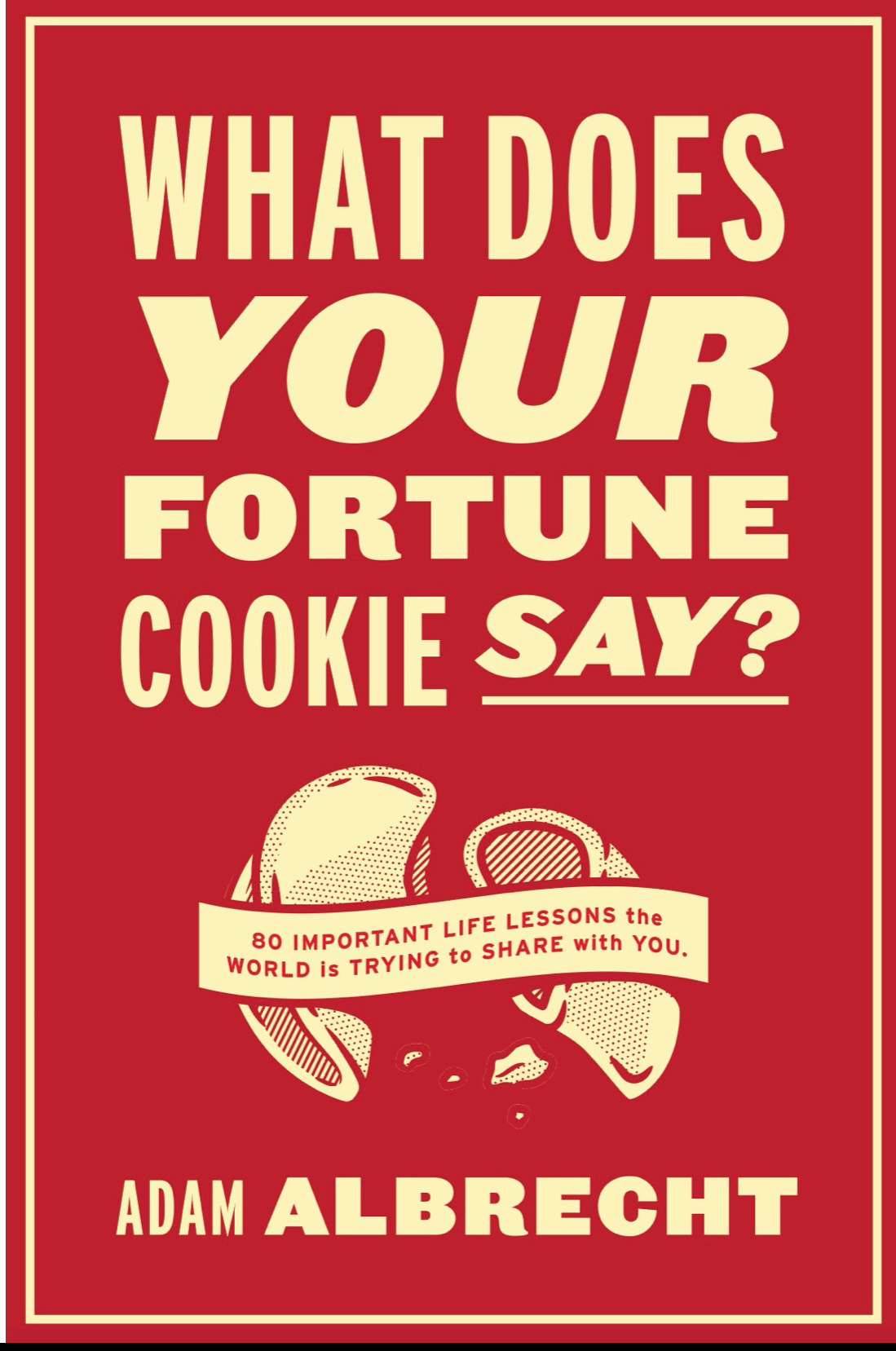
C
D
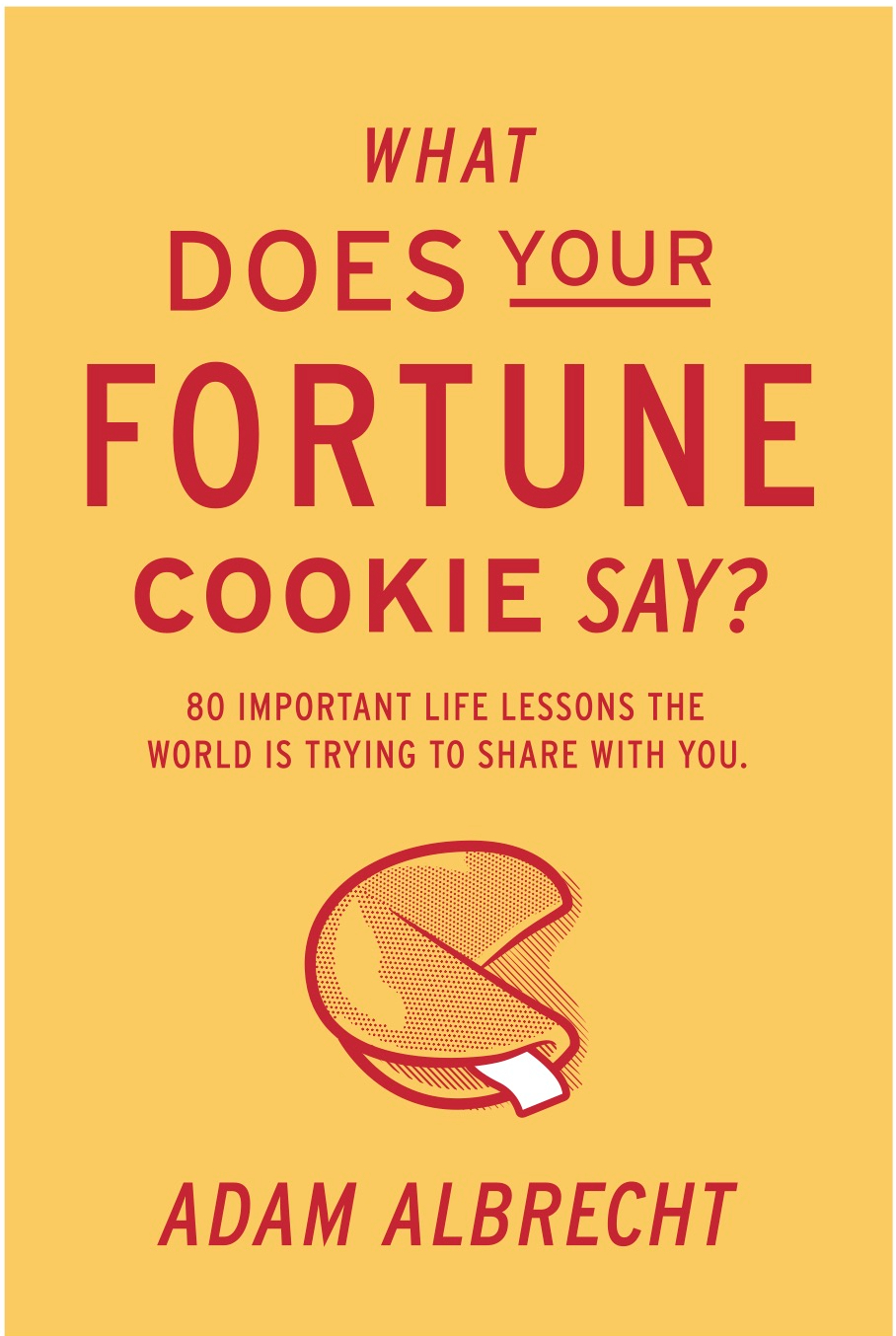
E
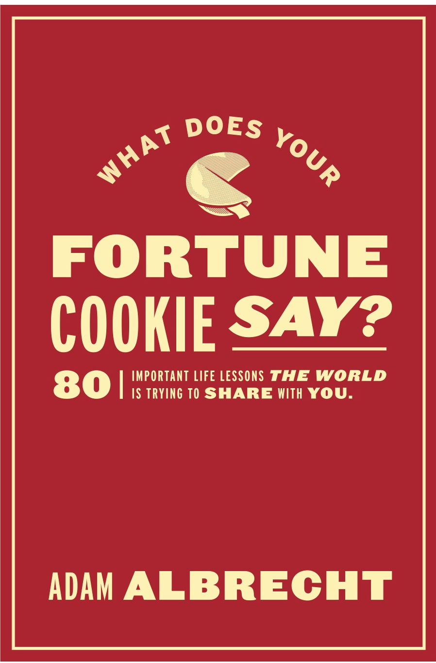
Here they are at a glance.
What do you like?
Please share your favorite in the comments section. If your favorite cover gets chosen there is a big high five coming your way the next time I see you.

A.
LikeLike
B
LikeLike
A
LikeLike
My book-reading senses would pick B in the store.
LikeLike
B
On Tue, Nov 2, 2021 at 8:29 AM Adam Albrecht Blog wrote:
> Adam Albrecht posted: ” This whole book-writing thing is getting realer > every day. I am close to publishing my first book called What Does Your > Fortune Cookie Say? with Ripples Media. And I am learning a lot in the > process. It turns out that you can’t just throw 200 pieces of p” >
LikeLike
C because it’s the only one where the cookie’s tongue isn’t hanging out like it’s a thirsty dog leaving the dog park.
But A because I like the emphasis on “your” and the print is bigger and easier for old people to read.
On the other hand, I don’t know how many old people care what their fortune cookie says so that might not be your target. 😂😂😂
Wanna know more?
LikeLike
A – I think this option looks more subtle but still interesting
LikeLike
D
LikeLike
D
LikeLike
I like C – the cookie looks best in that one. Best of luck with the book no matter which cover you choose.
LikeLiked by 1 person
A
LikeLiked by 1 person
Does A come with a box of Cheez-It’s? :). All look very cool, nice job to the designers! My eye’s go with D, the yellow cover – clean, nice soft flow top to bottom and sub-head, which pays off the title and reason for being, is a clear read quickly. Thanks for letting me play “client guy” Adam. Congrats on the book!
LikeLiked by 1 person
I vote A
LikeLiked by 1 person
A
LikeLiked by 1 person
B
LikeLiked by 1 person
B
I like the incorporation of the cookie as the “C” in cookie!
LikeLiked by 1 person
A….The easiest for me to read.
LikeLiked by 1 person
That’s a great reason Phil!
LikeLike
I’m changing my answer. C is still the best because there’s no tongue hanging out but I meant to say B because of the big letters, not A. See what I mean about old people? I can’t even do this right and remember my choice from seeing to saying! 🙄
LikeLiked by 1 person
A!
LikeLiked by 1 person
Nice choice Jenn!!!
LikeLike
I would say B because I like how the fortune cookie is the C in cookie, and that the words in on the cover are bigger and will be easier to read when you find it in a store.
LikeLiked by 1 person
Good choice and great reasoning Johann. Your mother has taught you well.
LikeLike
Adam, I like design ‘A’ because the title font is all the same size and it’s the cleanest to my eye. ‘A’ is also an awesome letter…Adam, Albrecht, Andy, etc. Good luck!
LikeLiked by 1 person
That is some grade A logic Andy!!!
LikeLike
“E” gets my vote
I like the color and the graphic balance. Not overwhelming in text appearance!
LikeLiked by 1 person
Great rationale Dan!
LikeLike
B
Like the larger white font, the emphasis on “your”, and the way the cookie is incorporated as a C
LikeLiked by 1 person
My vote is for A!
LikeLiked by 1 person
A.
BTW, when should I expect a signed copy?
LikeLiked by 1 person
C, because my name is Chad
LikeLiked by 1 person
Cha Ching!
LikeLike
I like #1
I like the use of the blank space and the white and yellow copy. Too much copy on the others. The underlines didn’t hit me.
Beth
LikeLiked by 1 person
I like “C” because it feels like you’ve opened the secret
LikeLiked by 1 person
A. I especially appreciate the font for your name there. I think the oversized look of B is trendy and not timeless. I would like to add that the look of the spine is very important to me as well, but maybe that is just a weird personal thing.
LikeLiked by 1 person
D, the bold FORTUNE catches the eye and makes me want to read it. I like color contrast vs the red books. If I was walking by a book stand with all these covers on display, again the title pops more on D. A is kind of a second option, the cookie looks more like cheese to me….was it all the time in Wisco?!
LikeLiked by 1 person
Good reasoning Jaime! Fortune cookies are funny looking things.
LikeLike
I like C or E
LikeLiked by 1 person
A
LikeLiked by 1 person
Good choice!
LikeLike
First choice A. Second choice C. But only since you asked. Congrats man – can’t wait to read it!
LikeLiked by 1 person
Thanks for the feedback and support Scott! I think you picked a winner!
LikeLike
A petite bite !😜
Martin Bernier
Président
Gestion Bay (2001) inc.
LikeLiked by 1 person
D because well Donna and the Yellow. I like the Yellow.
LikeLiked by 1 person